1) Global Population Change
From figure 1, below, it is clear to see that we are experiencing a rate of population increase hitherto unheard of. Since the 18th century population has increased at an exponential rate. To contextualise further, from between 1900-2000 the world’s population increased three times as much as in the entire history of humankind.
Population numbers can tricky to accurately obtain. This may be for a number of reasons including households not declaring all births, or governments lacking the resources to effectively record citizens’ data.
Indeed, even in America population counts are often over or underestimate absolute figures. As a result of these logistical difficulties global population figures can be considered approximations.
Currently, the best estimates of global population are provided by the UN Census Bureau. In 2015, the bureau estimated the global population at roughly 7.3 billion.
For a more up to date indication on the global population http://www.worldometers.info/world-population/ provides a useful tool to obtain ‘real time’ updates on current population estimates .
Population estimates also rely heavily on growth percentages. According the Population Reference Bureau Global human population growth amounts to around 75 million annually, or 1.1% per year.

Figure 1: Global Population Change
Here we can see the explosive growth in global population since the 1700's. Since the 1960's the population has increased by 1 billion roughly every 10-12 years.
2) Future Population Growth
Using averaged population growth rates, and how these have changed over time, experts can attempt to project and predict future population. We will investigate where these changes are most likely to occur shortly.
Looking to the future, according to population projections from the United Nations Population Division and population experts from several universities it is predicted that world population will rise from 7bn in 2011 to 8.4 billion by mid-2030, 9.6 billion by 2050, to peak at around 10.1bn in 2100.
With any projection, however, there is always an element of doubt. A relatively recent article from the guardian: (http://www.theguardian.com/environment/2014/sep/18/world-population-new-study-11bn-2100) suggest that this prediction may not be entirely accurate.
International team including UN experts, has recently stated that there is a 70% chance that population growth will not slow down by 2100, as previously thought, but could potentially rise to 12.3 billion by this time.
3) Spatial and temporal patterns of population growth (where and why it's happening)
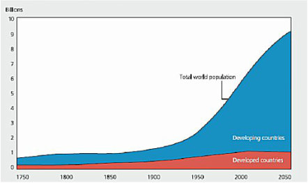 Figure 2: World population 1750-2050
It is evident that the vast majority of population growth has taken place in the developing world (figure 2). Since 1950 population growth in more developed countries has remained stable at ~1 billion. In the same period in less developed countries, however, the population has increased from roughly 1 to 5 billion. This is shown clearly in figure 2.
 Figure 3: Spatial distribution of population and population growth 2005-2010
We can see that presently China, India and Africa are the regions that have the largest current shares world population, accounting for nearly 2/3 of the world’s population. Europe, on the other hand, is expected to increase in population only very slightly by 2100. Since 1900 Europe’s share of the global population fell from ~1/4 to ~1/8 in 2000. Its current growth rate of just 0.1% will see this share decrease still further.
Conversely, the rapid growth of roughly 2% a year in the Arab states, and particularly Africa, will see their share of global population increase significantly in the next century.
Between 2003-2050 the population in Africa is expected to increase by just under 1 billion people, which will account for 1/3 of global growth in this time period.
Perhaps most interestingly Asia, and most prominently China’s population is expected to decrease. Indeed, despite experiencing a 2.4 billion population increase from between 1950-2000, this is set to decrease to just a 1 billion contribution from 2000-2050.
4) What drives population change and how do these factors vary over time?
The following video outlines briefly the main drivers behind the sudden population surge:
Put simply, the growth of the world population is due to the massive improvement of health around the globe. With more children surviving infancy, and an increase in medication available for those in need there are less dying from conditions other than natural causes. Through a combination of high birth rates, and declining death rates then, it is only to be expected that these conditions should facilitate an increase in population.
On the flip side, slower population growth of today is mostly due to falling fertility rates. Usually associated with more developed countries (which will be discussed in greater detail later)
The ratio between those being born, and those dying becomes smaller and smaller. This, subsequently, slows any growth in population and can even (if the death rate becomes larger than the birth rate) cause a declining population.
It should have become apparent that global population and population growth patterns change drastically over time. The mechanism behind the onset of population growth and the eventual slowdown of this population increase is the formalized in the model of the demographic transition model.
The demographic transition model
 Figure 4: Overview of the demographic transition model
To visualise this further, the following graph can be used to understand how this balance between birth and death rates can lead to an increase/decrease in population and how this relationship changes over time.
Demographic transition (DT) refers to the transition from high birth and death rates to low birth and death rates as a country develops from a pre-industrial to industrialized economic. Most developed countries are in stage 3 or 4 of the model; the majority of developing countries have reached stage 2 or stage 3. The major (relative) exceptions are some poor countries, mainly in sub-Saharan Africa and some Middle Eastern countries, which are poor or affected by government policy or civil strife, such as Yemen and Afghanistan.
Stages of the demographic transition model.
In stage one, pre-industrial society, death rates and birth rates are high and roughly in balance. All human populations are believed to have had this balance until the late 18th century, when this balance ended in Western Europe and population exploded.
In stage two, that of a developing country, death rates drop rapidly due to improvements in food supply and sanitation, which increase life spans and reduce disease. This mechanism of population growth was outlined in the above section, as countries in Africa and the Middle East progress through stage 2 of the model.
In stage three, birth rates fall due to access to contraception, increases in wages, urbanisation, a reduction in subsistence agriculture, an increase in the status and education of women, a reduction in the value of children's work, an increase in parental investment in the education of children and other social changes. Population growth begins to level off.
During stage four there are both low birth rates and low death rates. Birth rates may drop to well below replacement level as has happened in countries like Germany, and Japan, leading to a shrinking population , a threat to many industries that rely on population growth.
5) Population pyramids
Another, perhaps more visual way of showing rhe demographic transition model is through population pyramids. Put simply, population pyramids display the distribution of various age groups in a population (typically that of a country or region of the world), which forms the shape of a pyramid when the population is growing.
For a brief outline of the major features of population pyramids, consult the following video, in particular 0:45– 2:35:
For a brief outline of the major features of population pyramids, consult the following video, in particular 0:45– 2:35:
From the above video it should have been made apparent that a population pyramid consists of two back-to-back bar graphs, with the population plotted on the X-axis and age on the Y-axis, one showing the number of males and one showing females in a particular population in five-year age groups (also called cohorts). Males are conventionally shown on the left and females on the right, and they may be measured by raw number or as a percentage of the total population.
Population pyramids are often viewed as the most effective way to graphically depict the age and sex distribution of a population, partly because of the very clear image these pyramids present.
Population pyramids are often viewed as the most effective way to graphically depict the age and sex distribution of a population, partly because of the very clear image these pyramids present.

Figure 5: Examples of the 4 main forms population pyramids take, with specific pyramids from Angola and Japan
From figure 5, you can see that each stage from the demographic transition model has a correspondingly shaped population pyramid. Expanding population, as evidenced from population pyramids A and B are associated with stage 2 of the demographic transition model.
The specific example of Angola’s population pyramid is used to illustrate this further. Note the large base, indicative of a high birth rate, with the majority of the population less than 30 years old. This population pyramid is a typical example of the current demography of the developing world.
With developments in healthcare and family planning practices, and as the currently youthful population ages, it is most likely that the population pyramid for Angola will develop into one resembling pyramid C.
On the other end of the spectrum, population pyramids with the shape of Japan’s, with high life expectancy and low birth rates are associative of developed nations with a post industrialised economy.
6) Case Study. Japan: A demographic headache?
Overview
In Japan, a low fertility rate is combined with virtually no immigration (currently, less than 2 percent of Japan’s population is non-ethnically Japanese). This, combined with an aging population, has subsequently seen a declining population in the country.
The structural shift Japan is undergoing is indicated visually by figure 6 below, comparing the population pyramids for 1960, 2010, and 2060 (projected). If we compare the 2060 pyramid with that of 2010, we see that the former is not only smaller in total area, indicating a decline in overall population, but also substantially different in shape, revealing a major change in demographic structure. By 2060 the current pyramid (more urn shaped than anything) will be essentially an inverted pyramid.
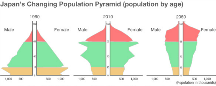
Figure 6: Changing demographic composition of Japan over time, shown in population pyramid form.
The high number centenarians suggested by the 2060 chart indicates that the number of Japanese citizens aged 100 or older is expected to grow from a mere 100 or so in 1960 to about 44,000 in 2010, and under the latest IPSS projection, will reach 637,000 by 2060.
On the other end of the spectrum, last year, the estimated number of newborn babies slumped to 1,001,000, an all-time low for the fourth straight year, according to recently released data by the country's Health, Labor and Welfare Ministry. The result means that Japan is expected to lose population over the next few decades. It is estimated that between 2010 and 2060, the population of Japan is projected to drop from 128.06 million to 86.74 million—a decline of 41.32 million, or roughly one-third, in a period of 50 years. Indeed, from 2040 on, the total population is projected to drop by more than 1 million annually.
This poses a major economic concern for the country. People over 65 and above are predicted to make up 40 percent of the total Japanese population by 2060. The recent figures are reason for concern for policymakers who seek to ensure that a dwindling pool of workers can support a growing number of pensioners. Moreover, with a shrinking number of the population occupying the 16-65 demographic, the country’s workforce has declined. This has the potential to cause a decline in consumption, making it difficult to attract more capital investments, and stimulate and maintain economic growth.
As this growing aging population has a very long average life expectancy (86.6 for women, 80 for men in 2013), medical costs will inevitably balloon, consuming an increasingly larger part of the budget together with pensions.
Solutions?
There are two things the government can do: 1) make having children more attractive and easier to young women and men by creating a more supportive environment and 2) Allow controlled immigration on a large level.
By all accounts Japan are attempting to adjust the government's restrictive stance on immigration. According to a government simulation, one possible solution for Japan at the moment is to begin accepting 200,000 immigrants per year starting in 2015 and raising the fertility rate to 2.07 births per woman. If both of these criteria are met, Japan’s 2060 scenario looks less grim, with a projected population of slightly over 100 million.
One policy approach could be to address Japan’s workplace gender inequality, which discourages women from pursuing both a career and a family.
